Monday 30 April 2012

Candy rock, candy floss and a very sticky scanner...!!


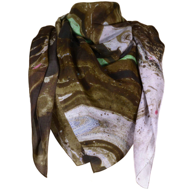
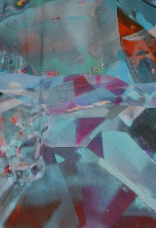
Glued I have been to my lovely Mac, engineering prints for my scarves! Yesterday I was really naughty and sandwiched some broken bits of rock (the sweet candy version) in my scanner...I will be in so much trouble! I manipulated the images into kaleidoscopic images, rotating and flipping, enlarging and reducing. 
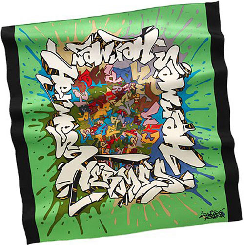
There is nothing I love more than photocopying and scanning things and then abstracting them.  Have to confess I have even had candy floss trapped in the scanner in last couple of days, although that has yet to appear in a design. Hopefully I have removed all the evidence...! Here is the work so far...not the finished article, but definitely getting there. I am going to print a sample on silk tomorrow all being well and then make final decisions about colour and further development. I have decided to try some different orientations and shapes as well as styles, so that I can show some diversity in my collection, but keeping colour palette as a constant throughout. This is becoming a bit tricky a times and I feel I need to reign this in now as I am reaching the final phase! I also produced a very different style of scarf, which has been a hit amongst my friends. It's very different to the candy rock scarf, but I am like both the symmetry of the bird design and the abstract print in the candy print...hmmm decisions, decisions!!?


Tuesday 24 April 2012

Yulia Brodskaya

Wow wow and wow...check out Yulia Brodskaya's work using quilling technique. It brings a whole new dimension to paper arts. Just awesome! Have already bought myself a quilling tool to have a bash, although I am sure my attempts will be pitiful against these wonderful pieces.


http://trendland.com/

Contrast...

For a long time I have been a huge fan of Claudia Carviezel's work...I love her ability to show such diversity and her amazing use of colour! Basically she shows no fear in her work...and if bold is required, bold is what is delivered. I revisited her body of work again today as I was having an inner battle with colour palette. I have found lately that having learned to be restrained in use of colour I am now a bit fearful about being indulgent with it. This has been true with my new scarf designs where I have gone backwards and forwards to try and find a happy blend of vintage delicacy and contemporary boldness. The truth is I haven't been sure if I am finding a happy medium? However, looking at Claudia Carviezel's work again has been me think that ultimately the design needs to be fit for purpose. In this instance I want my scarves to be interesting and stimulating when they are worn not just to look at as a whole design. For me this means good use of contrast in the design when draped around the neckline. Going to keep experimenting to find that elusive all important balance!


Monday 23 April 2012

View through the telescope...

In a previous post I shared about my litte enchanted evening at sunset on Blackpool North pier. At the end of the pier was this telescope and it immediately gave me some inspiration for a design. I started to think about how the image seen through the viewfinder captures a small aspect of a whole picture or scene and how when this is narrowed down that the image becomes magnified and the sole focus of attention. I went on to muse over how this could also relate to different aspects of time and different eras and considered how all these things could be explored in varied scale and blended together within a design. 


 I started to collect together drawings and old and new photos and capturing little circular snippets which best represented the overall image. It was really great fun and I could have gone on and on with this concept. Here is the first draft on the design, which incorporates the backs of old photos, line drawing and ink patterns along with a little bit of text (which I will probably omit in further development) as I think it makes the design look too contrived?

Saturday 21 April 2012

New scarf design...

This is a potential new design for my final collection of scarves. I started by illustrating layers of rock and paint and by hiding little images and references to my theme inside the layers of rock.... Once I had completed my drawing work I scanned the backs of old photos from my family albums to add a background with a vintage feel. I then blended this with an image of scanned fabric which I had used a shibori technique on to produce a light grungy look which is on trend currently. Final I created a bush preset and added birds from a photograph I took in Blackpool. I love the finished design and am now ready to sample on different fabrics using digital print. I already feel that silk is going to be the fabric of choice for the final piece. Once printed I will then start to experiment with some light embellishment. I do think that this design will sit well in my chosen target
market.

Friday 20 April 2012

My street art...

I have been busy applying my own street art to some of the landmarks in my local town...but don't worry I haven't committed any illegal acts and I am certainly not heading for an ASBO any time soon. I have been experimenting with blending images using CAD. In this shot I was inspired by the designer Philip Roucou who has launched a collection of beautiful scarfs with retro photo shots. In this case I have used one of my recent photos of the Dome in Whitley Bay and blended it with one of the ink drawings I have done today. I have then added a filter to create a vintage look. This is one of my attempts at colouring photos but using a more contemporary technique. I think this would be lovely printed digitally onto silk as the contrast between the photo and the colour in the drawing is quite striking. I intend to explore more work using unusual ways of colouring photos. I have recently been really inspired by the work of Jose Romussi's Photo embroidery...similar to that of Maurizio Anzeri, Romussi adds threads to old vintage photos but unlike Anzeri he adorns the garments worn by the subject rather then their faces. I find Romussi's work more appealing and a more adaptable approach for commercial products, but do find Anzeri's work more thought provoking and edgy.

Jose Romussi

Thursday 19 April 2012

Lakeca Mixed Media Illustrations...

Perusing the internet today I stumbled across these amazing illustration using mixed media techniques by Lakeca. I absolutely love them and feel like I had another eureka moment as I feel it is what I have been trying to achieve with my own work incorporating pattern and hand drawing along with photographic elements. I think further experimentation with this is definitely help me to get to my final outcome. rolling my sleeves up as we speak for an afternoon of collage and drawing!


Wednesday 18 April 2012

Prick and pounce design transfer method

Hand and Lock...Epic adventure


I am recovering from a whirlwind trip to London to attend a tambour beading workshop at the very prestigious Hand and Lock! It was a really awesome experience just visiting the company let alone attending the workshop. The whole atmosphere of the place is steeped in craftsmanship, tradition and the highest level of quality. I was struck by how incredibly talented the people working there are and how they have invested their lives in honing their skills to the highest level. I was really blown away, but it got me thinking about my own work. I have always loved embroidery, but have tended to invest my time most recently in machine embroidery to the exclusion almost of enhancing my hand embroidery skills. iIstarted to think that it may be valuable to start to try to blend the two skills a little more to enhance the effects of my machine embroidery. I definitely intend to do some sampling using the Tambour beading technique and am considering incorporating this on some small coin purses as part of my final collection.

http://lindalightleyunit3.blogspot.co.uk/


Tambour beading

I love this example of tambour beading on tulle by Linda Lightley. I love the mix of different colours of beads and sequins. I found the technique very tricky as it seems like a sort of cross between sewing and crochet. It was so easy to get the hook caught on the delicate fabric and to lose all your stitches. I will definitely pursue it as a technique as the finished result is so worth it. Practice makes perfect I guess, so I have already bought myself a hoop with a stand to get started.

Prick and pounce...

I have long been a bit bemused by how to transfer embroidery designs properly and so have usually drawn them onto dissolvable stabiliser which can be washed away. I have finally found that the correct way for image transfer is the "prick and pounce" method which involves overlaying the design onto the chosen fabric usually on tracing paper and then pricking the paper over the design. A chalky powder called pounce is then rubbed gently over the design leaving the outline of the design on the fabric which can be joined up by a suitable pen or pencil. Just wish I had learned this sooner!!

Sunday 15 April 2012

E is for Eclectic

I have been playing around with my photos from Blackpool and some of the work from my sketchbook. It seems I am still fixated with this idea of street art and I thought I would experiment using CAD to do my own graffiti art. I have combined a few of my own photos and manipulated them digitally and then used my ink blot drawings as an overlay. I was really pleased with the outcome as I love the sharp angular graphic background in contrast with the abstract ink drawing. Also feel the ink has a sense of splashing up in the foreground like waves. I like the asymmetry of the print which I think makes the scarf very contemporary. I may need to consider the finishing size of the scarf, but think ultimately it may make a great scarf as the drapes and folds would have fabulous contrast... Would love your comments on this one!

Saturday 14 April 2012

For the love of the LOO....!

On our way back from hols we pit stopped at a fab cafe in Harrogate called Fodder, not only was the food awesome, but the loos were equally stupendous...got me thinking yet again about by FMP....layered plastic bottles ...hmmm??


Wednesday 11 April 2012

Murmuration at last...!


I have spent the past week on holiday in the idyllic countryside of the Ribble Valley, by as work was never far from my mind I persuaded a very unwilling bunch to leave the rural delights and head for the seaside so that I could get some snaps...the enthusiasm at the outset was pitiful but I have to say by the end of the day we had al had a fab day out in a very clean and friendly Blackpool. Having been a number of times over the years i have to say i have never been a real fan, but I had a truly memorable experience at the end of the day! Just as we were about to leave the sun started to set and I decided to catch the remains of the light. We stopped at the North pier...I went below the pier and got some shots from the beach and then went onto the pier itself. The experience on the pier was thrilling...it was almost totally deserted and yet music was still being played down the length of it.... at the end I felt like I had found treasure not only did I stumble upon a stunning vintage carousel ride but also found sone smaller beautiful fairground rides which i suspect dated back to the forties! All this was combined with a murmuration of starlings swooping around the end of the pier in delightful patterns and formations. I felt truly blessed as all this was framed by a stunning sunset...heavenly. Here are just a few of the photos I took...


I love the contrast of the silhouettes in these photos of the pier and the birds and adore some of the angular patterns in the structure beneath the pier.


I was totally enchanted by this little organ in the centre of a small carousel ride, I love the colour palette and all the different shapes and elements of the pipework and little drum. i feel really inspired to incorporate elements of this within my work....I just couldn't stop looking at  all the detail...I only wish I had more time to take more photographs of it. 

I was struck by how pretty even the lighting was on the fairground ride, I thought these bulbs were typical of the attention to detail in these very elegant fairground rides...loved also how rudimentary the wiring looked and even how decorative the electrical box was...


I took this shot as we were driving along the sea front, although the photo is not the most perfect it's one of my favourites and I feel it has lots of scope for development digitally.

Monday 9 April 2012

Painterly sensation...

I have become somewhat obsessed with the notion of wearable street art and the whole eclectic mash-up look...it seems that I am playing catch up though judging by this amazing collection by Luke Brooks...

I am so inspired by this garment...struck by the beauty in the contrast of colour and the abstract design which while appearing really urban and grungy is also really feminine and beautiful...totally buzzing!


Saturday 7 April 2012

Layers of thread...

Machine Embroidery...varied thickness threads
Recreating layering with free motion embroidery
Inspired further by Leslie Shows gorgeous layering effect I have been experimenting with my beloved free-motion embroidery. Using varied threads to create extra texture and depth. I love the mix of the neutral pastels with the strong black contrast. I am also experimenting with new types of stabilisers, this one is burn off muslin which I haven't tried before. I have lots of ideas about how to incorporate this into both a garment and scarves...lots of experimentation to do first though!

Thursday 5 April 2012

Emma Lundgren


Wow I have just been exposed to the world of Emma Lundgren and quite frankly I have to say "what is there not to like about Emma's work?" It is scintillating beyond measure with a mash-up of print. laser cutting and embellishment all mixed with bold colour blocking. It's so edgy and graphic and yet the detailing in the etched leather is really delicate- LOVE IT! It has really inspired me to be much more adventurous with my own work and I would love to explore mixing these techniques for fashion accessories in my final major project.


Wednesday 4 April 2012

Contrast...

Continuing to explore the concept for my colour palette I have found some images which use this type of pallet in a sophisticated and sensitive way...


http://sixandahalfstitches.typepad.com/


http://darrenbrownphotography.com/


Scarves, scarves, scarves....

Top Ten

For my final major project I am working in collaboration with an amazing local independent boutique, we have decided that I will design silk  scarves as part of my final collection which will be displayed in the shop...I am so excited and have been exploring this season's (SS12) bounty of scarves for inspiration...this is my Top Ten List...

Etro


Edition de Luxe


Hermes


Rihanna Phillips

Faliero Sarti


Swash


Wyart


Topshop


Philip Roucou


Tuesday 3 April 2012

Digital Prints v Traditional Techniques...?

I am the biggest fan of digital print, but lately I have been challenged to take a fresh look at traditional techniques. I have to admit that at first I was not enamoured with the idea being someone who prefers to work with dry media. Having played around with a few different techniques I then decided to revisit batik. I wanted to use the technique to create a layered look but also to incorporate references to architecture and landmarks from my hometown.


Monday 2 April 2012

Fashion Designers who Rock!

Fred Butler

One of my favourite fashion designers has got to be Fred Butler. Her work is so 'out the box' and innovative. Her construction is in a world of its own and is haute couture with a capital 'H". The thing I personally most love about her work is her use of colour which is so bold and she capitalises by combining colour with geometric design making it truly striking. In her AW12 collection she uses quilting and fabric manipulation to emphasise both shape and colour which makes the design really strong. Having previously used quilting in a more conservative way within my work I would like to take inspiration from this work and be much bolder in using this technique within this work and in particular with fashion accessories.